Settings · Placket 1.0.0
Theme settings
Last updated: November 2, 2026
Theme settings control the look of the whole store: colors, fonts, spacing, buttons, product cards and more. To open them:
- In your Shopify admin, go to Online Store > Themes.
- Next to your theme, select Customize.
- In the left bar, select Theme settings (the paintbrush icon).
- Open a group, change a setting and select Save.
Defaults below are the values of the Placket preset. The Bodice preset uses different values for some settings. See Presets for the differences.
Groups in the order they appear: Colors, Typography, Layout, Buttons, Inputs, Product cards, Badges, Image captions, Animations, Cart, Search, Country selector and currency, Social media, Back to top, Favicon.
Colors
The theme uses five color schemes. Every section has a Color scheme setting where you pick one of them. Change a scheme here and every section that uses it updates.
In the theme editor the schemes are listed as Scheme 1 to Scheme 5. The numbers are the same in both presets, but the colors differ. In general:
| Scheme | Use | Placket color | Bodice color |
|---|---|---|---|
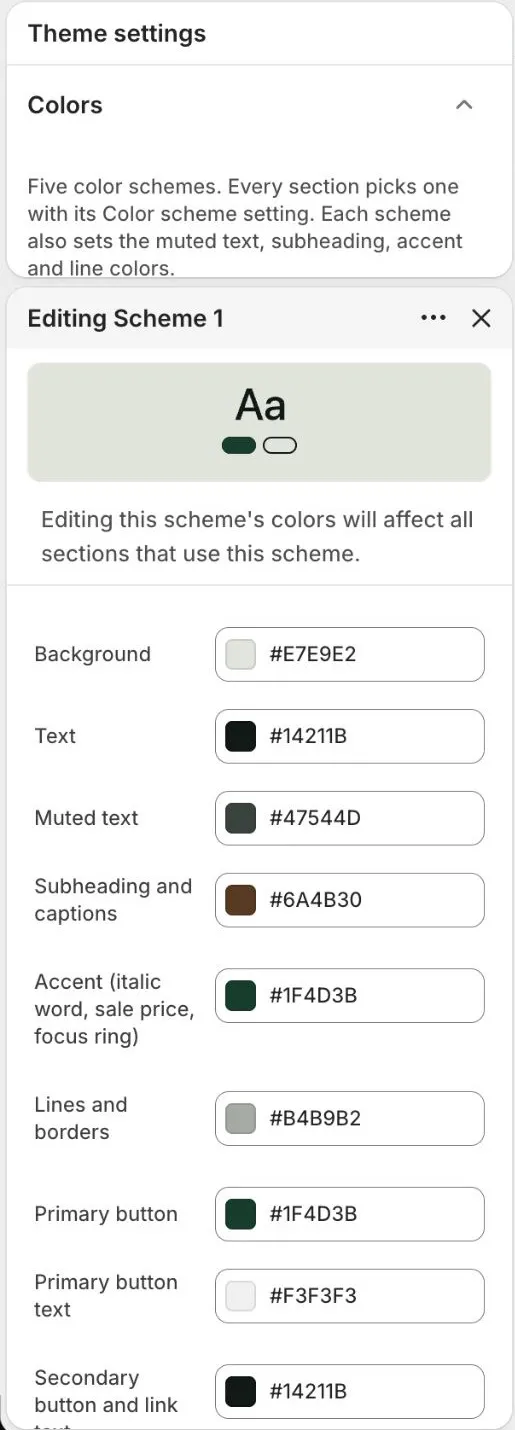
| Scheme 1 | Main page background and most sections | Mist, a light gray-green (#E7E9E2) | Very dark (#1A1114) |
| Scheme 2 | Image backgrounds and quiet bands | Light gray (#F3F3F3) | Dark (#241A1D) |
| Scheme 3 | High-contrast bands, such as the footer and announcement bar | Dark green (#14211B) | Wine (#4B1A24) |
| Scheme 4 | Strong accent bands, such as the newsletter | Green (#1F4D3B) | Ivory (#EFE8DD) |
| Scheme 5 | Cards and panels | White (#FFFFFF) | Light ivory (#F7F3EC) |
Each scheme has these color fields:
| Field | What it colors |
|---|---|
| Background | The section background |
| Text | Headings and body text |
| Muted text | Secondary text such as notes and captions |
| Subheading and captions | Small labels above headings and image captions |
| Accent (italic word, sale price, focus ring) | The italic word in headings, the sale price and the keyboard focus ring |
| Lines and borders | Rules, borders and dividers |
| Primary button | Button background |
| Primary button text | Text on the primary button |
| Secondary button and link text | Text of the secondary button and of links |
To change a scheme, open Theme settings > Colors and select a scheme swatch (Edit Scheme 1 to Edit Scheme 5). Its color fields open in a panel:
Tips:
- Keep enough contrast between text and background. A ratio of 4.5:1 or more keeps body text easy to read. Check pairs with a free contrast checker.
- Several settings ask for a scheme by name, for example Image plate color in Product cards and Panel color scheme in the country selector.
Typography
Fonts
| Setting | Choices | Default | Notes |
|---|---|---|---|
| Heading font | Font | Instrument Serif | |
| Body font | Font | Figtree |
Scale
| Setting | Choices | Default | Notes |
|---|---|---|---|
| Heading size | 80 to 140% | 100% | Scales every heading. At 100%: small 64px, medium 88px, large 104px. Image hero and slideshow also offer extra large 118px. Sections pick a step with their Heading size setting. |
| Body text size | 90 to 120% | 100% | |
| Heading letter spacing | Tight; Normal; Wide | Tight | |
| Heading line height | Tight; Normal | Tight |
Accent word
| Setting | Choices | Default | Notes |
|---|---|---|---|
| Accent word style | Italic and accent color; Italic only; Accent color only; No change | Italic and accent color | Applies to the italic word inside a heading. Italicize one word in the heading text to use it. |
| Subheading style | Short rule, then text; Text only | Short rule, then text | |
| Label style | Sentence case; Uppercase, spaced | Sentence case | Applies to menu links, buttons, subheadings, badges and footer menu headings. Headings and body text are not changed. Uppercase uses small, widely spaced letters. |
Notes:
- Choose fonts from Shopify's font library. Font names appear as in the picker.
- The Placket preset uses Instrument Serif (headings) and Figtree (body). The Bodice preset uses Fraunces (headings, semi-bold) and Jost (body).
- Heading size scales all headings. With the setting at 100%, small is 64 px, medium 88 px and large 104 px. Sections let you pick a step.
- To make one word in a heading stand out, select it in the heading field of a section and apply italic. Accent word style controls what that looks like.
- Label style to Uppercase, spaced makes menu links, buttons, subheadings, badges and footer menu headings uppercase. Headings and body text do not change.
Layout
Page
| Setting | Choices | Default | Notes |
|---|---|---|---|
| Maximum page width | 1200 to 1920 px | 1440 px | |
| Side padding, desktop | 16 to 96 px | 56 px | |
| Side padding, tablet | 16 to 64 px | 32 px | |
| Side padding, mobile | 12 to 32 px | 20 px |
Grid
| Setting | Choices | Default | Notes |
|---|---|---|---|
| Column gap, desktop | 8 to 48 px | 24 px | |
| Column gap, mobile | 8 to 24 px | 14 px |
Section spacing
| Setting | Choices | Default | Notes |
|---|---|---|---|
| Section spacing on mobile | 40 to 100% | 60% | Percent of each section's top and bottom padding, applied to every section on screens up to 749px. 60% turns 150px into 90px. |
Notes:
- Maximum page width limits the content width on very wide screens. Backgrounds still run edge to edge.
- Side padding is the space between the content and the screen edge. Set different values for desktop, tablet and mobile.
- Section spacing on mobile shrinks the top and bottom padding of every section on phones. At 60%, 150 px of padding becomes 90 px.
Buttons
| Setting | Choices | Default | Notes |
|---|---|---|---|
| Corner radius | 0 to 40 px | 0 px | |
| Border width | 0 to 3 px | 1 px | |
| Button height | 44 to 64 px | 54 px | |
| Show arrows on buttons and links | On or off | On | Primary buttons and text links such as View all and Shop now. |
| Hover effect | Swap to text color; None | Swap to text color |
Notes:
- These settings style every theme button: the primary button, the secondary button and Add to cart.
- Hover effect > Swap to text color swaps the button and text colors when the pointer is over the button.
- Wallet buttons, such as Shop Pay and PayPal, keep their own look. Their colors are set by the payment provider and cannot be changed.
- The minimum touch height is 44 px.
Inputs
Style for form fields, such as the email field in the newsletter and the contact form.
| Setting | Choices | Default | Notes |
|---|---|---|---|
| Field style | Boxed; Underline | Boxed | |
| Corner radius | 0 to 20 px | 0 px | |
| Border width | 1 to 3 px | 1 px | |
| Field height | 44 to 64 px | 52 px |
Product cards
The card is the small tile for a product in grids, search results and recommendations.
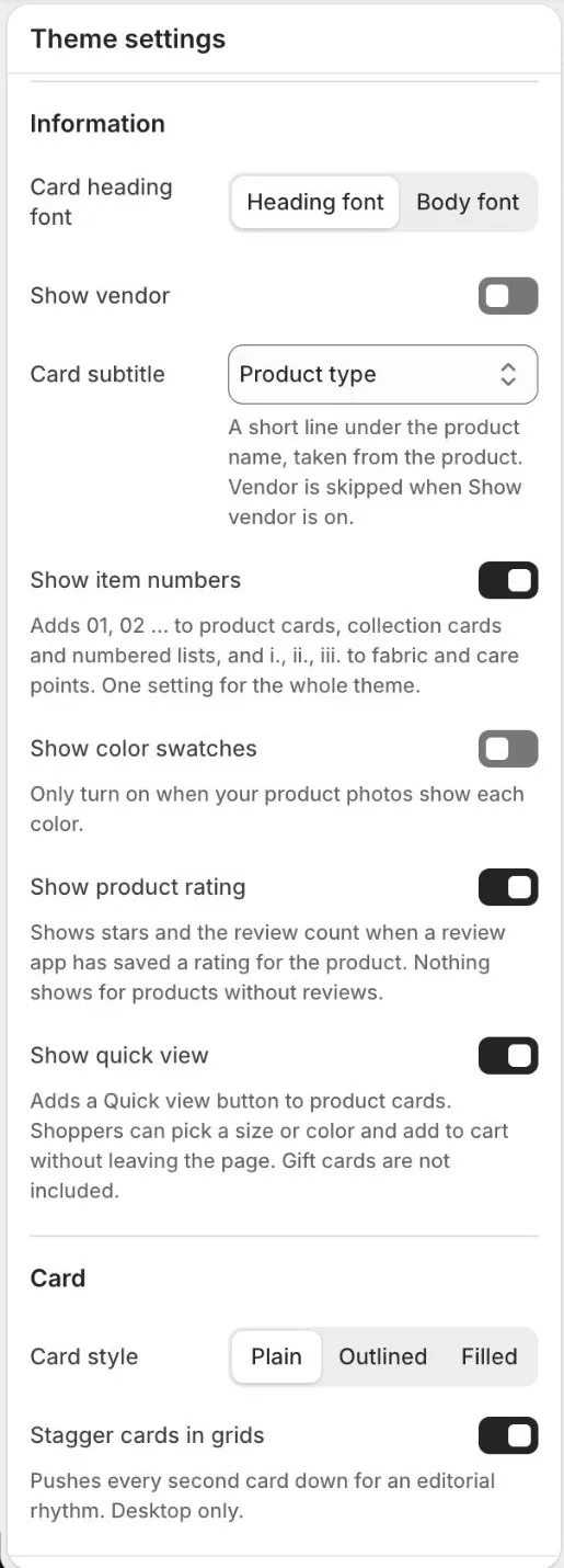
The settings for the card are in Theme settings > Product cards. Image, Information and Card are the three blocks of settings, and Show product rating and Show quick view are in Information:
Image
| Setting | Choices | Default | Notes |
|---|---|---|---|
| Image ratio | Adapt to image; Portrait (4:5); Square (1:1); Landscape (3:2) | Portrait (4:5) | |
| Image plate color | Any color scheme | Scheme 2 | Background shown behind and around product images. |
| Show second image on hover | On or off | On | Desktop only. Mobile always shows the first image. |
Information
| Setting | Choices | Default | Notes |
|---|---|---|---|
| Card heading font | Heading font; Body font | Heading font | |
| Show vendor | On or off | Off | |
| Card subtitle | None; Product type; Vendor | Product type | A short line under the product name, taken from the product. Vendor is skipped when Show vendor is on. |
| Show item numbers | On or off | On | Adds 01, 02 ... to product cards, collection cards and numbered lists, and i., ii., iii. to fabric and care points. One setting for the whole theme. |
| Show color swatches | On or off | Off | Only turn on when your product photos show each color. |
| Show product rating | On or off | On | Shows stars and the review count when a review app has saved a rating for the product. Nothing shows for products without reviews. |
| Show quick view | On or off | On | Adds a Quick view button to product cards. Shoppers can pick a size or color and add to cart without leaving the page. Gift cards are not included. |
Card
| Setting | Choices | Default | Notes |
|---|---|---|---|
| Card style | Plain; Outlined; Filled | Plain | |
| Stagger cards in grids | On or off | On | Pushes every second card down for an editorial rhythm. Desktop only. |
Quick view
Quick view opens a window over the page with the product's photos, price, options, quantity and an Add to cart button. Shoppers do not leave the collection page.
- On a computer with a mouse, the Quick view button appears at the bottom of the card photo when the shopper points at the card. It also appears when a shopper moves to the card with the keyboard.
- On a phone or tablet, a small button with an icon sits in the corner of the photo.
- The window has a link to the full product page. It closes with the close button, the Escape key or a tap outside it.
- After a shopper adds the item, the window closes and the cart drawer opens. When Cart type is Page, the shopper goes to the cart page.
- Quick view does not show for gift cards. A gift card needs a recipient form, so shoppers open the product page.
To turn it off:
- Go to Online Store > Themes > Customize > Theme settings > Product cards.
- Turn off Show quick view.
- Select Save.
Quick view is on in both presets. It works wherever product cards show, such as collection pages, search results, recommendations and featured products.
Product ratings on cards
The theme does not collect reviews itself. A review app collects them and saves two standard product metafields: reviews.rating and reviews.rating_count. Judge.me and other review apps fill these. When both are present, the card shows stars and the number of reviews, such as 4.5 stars and (12).
- Install a review app from the Shopify App Store and collect a few reviews.
- Check that the app writes the standard rating metafields. See the app's help page.
- In Theme settings > Product cards, check that Show product rating is on.
Products without reviews show nothing. This setting also controls the stars in the quick view window. For the Rating block on the product page and for the review widget, see Product page > Reviews and stars.
Notes:
- Card subtitle shows a short line under the product name. Choose Product type or Vendor (both are standard fields on the product in Shopify admin), or None to hide the line. If the product has no value for the field, no line is shown. When Show vendor is on, the vendor is already shown on its own line, so the Vendor subtitle is skipped. The same line also appears under the price in the Featured product section.
- Show color swatches shows small color dots (up to five, then a "+" count) when a product has a Color option with swatches. Turn it on only when your product photos show each color. See Product page.
- Show item numbers adds 01, 02 and so on to product cards, collection cards and numbered lists. It also numbers fabric and care points. This is one setting for the whole theme.
- Stagger cards in grids moves every second card down for an editorial look. It works on desktop only.
- The second image on hover is shown on desktop only.
Badges
Small labels on product images.
| Setting | Choices | Default | Notes |
|---|---|---|---|
| Badge style | Solid block; Outline; Text only | Solid block | |
| Position on image | Top left; Top right; Bottom left | Top left |
New
| Setting | Choices | Default | Notes |
|---|---|---|---|
| Show New badge | On or off | On | |
| Product tag for New | Text | new | Products with this tag show the badge. |
| New badge colors | Any color scheme | Scheme 3 |
Sale
| Setting | Choices | Default | Notes |
|---|---|---|---|
| Show Sale badge | On or off | Off | Sale is always shown in the price. The badge is optional. |
| Sale badge colors | Any color scheme | Scheme 4 |
Sold out
| Setting | Choices | Default | Notes |
|---|---|---|---|
| Show Sold out badge | On or off | On | Shows when a product has no stock left (real inventory, never faked). |
| Sold out badge colors | Any color scheme | Scheme 2 |
Notes:
- The New badge shows on products that have the tag you enter in Product tag for New (default
new). Add the tag in Products > open a product > Tags. - The Sale badge is optional. A sale price is always shown in the price, with or without the badge.
- The Sold out badge shows only when a product has no stock left. It reflects real inventory and is never made up.
Image captions
Small labels under images, such as "Plate 01" or "Fig. 3". They come from the Caption fields in sections.
| Setting | Choices | Default | Notes |
|---|---|---|---|
| Caption style | No captions; Plate labels; Figure labels; Plate labels, then figure labels | Plate labels, then figure labels | |
| Captions labeled Plate | 1 to 12 | 2 | Only used by Plate labels, then figure labels. The first captions on a page read Plate; later ones read Fig. Numbering continues down the page. |
| Italic serif label | On or off | On |
Notes:
- Caption style > Plate labels, then figure labels: the first captions on a page read "Plate" and later ones read "Fig.". Captions labeled Plate sets how many are "Plate" labels. Numbering continues down the page.
- No captions hides all captions, even if you typed text in a Caption field.
Animations
Animations are always turned off for visitors who prefer reduced motion.
| Setting | Choices | Default | Notes |
|---|---|---|---|
| Reveal sections on scroll | On or off | Off | |
| Reveal style | Fade in; Fade and rise | Fade and rise | |
| Zoom images on hover | On or off | On | Desktop only. |
Animations are always turned off for visitors whose device is set to reduce motion.
Cart
| Setting | Choices | Default | Notes |
|---|---|---|---|
| Cart type | Drawer; Page | Drawer | |
| Cart icon | Bag; Cart; Basket | Bag | |
| Free shipping threshold | Number | 0 | In your store currency, whole units. Drives the free shipping message and progress bar in the cart. Set 0 to hide them. |
Notes:
- Cart type > Drawer opens a side drawer. Page sends shoppers to the cart page. See Cart sections.
- Free shipping threshold is entered in your store currency as a whole number. It drives the free shipping message and progress bar in the cart. When a shopper pays in another currency, the amount is converted using Shopify's rate and rounded up to a whole unit. Set 0 to hide the message. The bar does not change your shipping rates: set a matching free shipping rate in Settings > Shipping and delivery.
Search
Settings for the search drawer in the header (predictive search).
| Setting | Choices | Default | Notes |
|---|---|---|---|
| Enable predictive search | On or off | On | |
| Show query suggestions | On or off | On | |
| Products to show | 2 to 10 | 4 | |
| Show price | On or off | On | |
| Show articles and pages | On or off | On | |
| Highlight matching text | On or off | On |
Notes:
- When Enable predictive search is off, the search field opens the search page with the normal results.
- Pick whether search opens as a drawer or a page in the Header section.
Country selector and currency
Applies to every country selector: header, mobile menu and footer.
| Setting | Choices | Default | Notes |
|---|---|---|---|
| Show search field | On or off | On | |
| Show flags | On or off | Off | |
| Show currency code and symbol | On or off | On | |
| Note under the list | Text | Prices and checkout currency update when you change country. | |
| Panel color scheme | Any color scheme | Scheme 1 | |
| Show currency code in prices | On or off | Off | Adds the code after prices in the cart and on product pages, for example $98 USD. |
Notes:
- These settings apply to every country selector: in the header, the mobile menu and the footer.
- The selector only shows when your store sells in more than one country or language. See Translations and markets.
- Flags are drawn with emoji. Some Windows devices show country letters instead of flags.
Social media
Paste the full address of each profile, for example https://www.instagram.com/yourname. Only networks with a link are shown, in places where a section turns social media icons on (the Footer does).
Only networks with a link are shown, where a section turns social media icons on.
| Setting | Choices | Default | Notes |
|---|---|---|---|
| Link | Empty | ||
| Link | Empty | ||
| Link | Empty | ||
| TikTok | Link | Empty | |
| YouTube | Link | Empty | |
| X | Link | Empty | |
| Snapchat | Link | Empty | |
| Tumblr | Link | Empty | |
| Vimeo | Link | Empty | |
| Link | Empty |
Back to top
A small button in a bottom corner that takes shoppers back to the top of the page.
| Setting | Choices | Default | Notes |
|---|---|---|---|
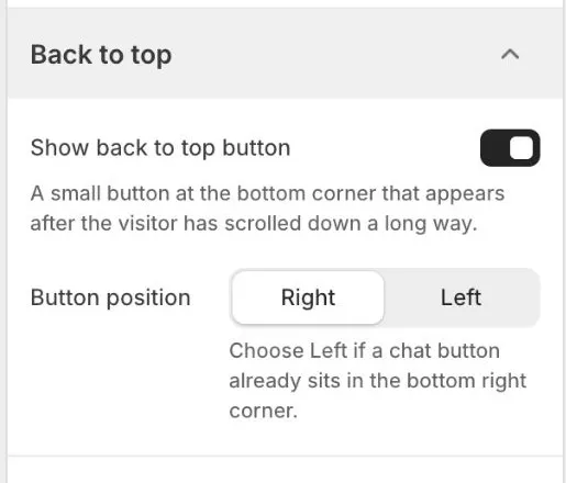
| Show back to top button | On or off | On | A small button at the bottom corner that appears after the visitor has scrolled down a long way. |
| Button position | Right; Left | Right | Choose Left if a chat button already sits in the bottom right corner. |
Notes:
- The button appears after the shopper has scrolled about two screens down.
- On the product page it sits above the sticky add to cart bar on phones.
- Selecting it scrolls smoothly to the top. Shoppers who prefer reduced motion jump to the top at once. The button works with the keyboard.
- Both presets have it on, at the right.
Favicon
The small icon shown in the browser tab.
| Setting | Choices | Default | Notes |
|---|---|---|---|
| Favicon | Image | Empty | 32 x 32px .png recommended. |
A 32 x 32 px .png file works best.
Theme information
At the bottom of the theme settings you can see the theme name (Placket), the version (1.0.0), the author (Devoptly), and links to the documentation and support pages.