Sections · Placket 1.0.0
Sections reference
Last updated: November 2, 2026
Sections are the building blocks of every page. This reference lists every section in the Placket theme, with the exact names and settings you see in the theme editor.
How to add, move and remove sections
- In your Shopify admin, go to Online Store > Themes.
- Next to your theme, select Customize.
- At the top of the editor, use the page picker to open the page you want to change (for example Home page or Products).
- In the left sidebar, select Add section. Pick a section from the list.
- Drag a section by its handle to move it. Select a section, then select the three dots (or the trash icon) to hide or remove it.
- Select Save.
Sections that have blocks show a small arrow in the left bar. Select the arrow to see the blocks. The link at the top of the list adds a block, for example Add Collection or Add Hotspot. Here the Featured collections and Shop the look sections are open:
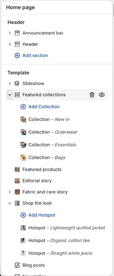
Some sections can only be added to certain pages. Each section below says where you can add it. Sections named "main" in the templates (Product information, Product grid, Search results, Cart page and so on) are the core of their page. They are already in place and cannot be added to other pages.
Pages in this reference
| Page | Sections |
|---|---|
| Header, footer and announcement bar | Announcement bar, Header, Footer |
| Hero, slideshow and collections | Slideshow, Image hero, Featured collections, Featured products, Featured product |
| Content sections | Editorial story, Image with text, Rich text, Multicolumn, Image gallery, Logo list, Scrolling text, Testimonials, Video, Collapsible content, Map |
| Story and marketing sections | Fabric and care story, Shop the look, Lookbook, Capsule launch, Blog posts, Newsletter, Newsletter popup |
| Product page sections | Product information, Complete the look, Fit guide, Size guide drawer, Product recommendations, Recently viewed |
| Collection and search sections | Collection banner, Product grid, Collection list page, Search results, Predictive search |
| Cart sections | Cart page, Cart drawer |
| Blog and article sections | Blog, Article |
| Page sections | Page header and content, FAQ, Size guide page, Contact form, Stockists and events, Page not found, Password page, Gift card |
| Custom code and apps | Custom Liquid, Apps |
Settings that many sections share
These settings appear in many sections. They work the same way everywhere.
Color scheme. Picks one of the five color schemes (Scheme 1 to Scheme 5) you set up in Theme settings > Colors. The scheme sets the background, text, button and line colors for the whole section.
Heading and Heading size. Headings are "Text (italic word allowed)". To get the accent word, select one word in the heading and apply italic (Ctrl+I on Windows, Cmd+I on Mac). How that word looks (italic, accent color, both or no change) is set by Accent word style in Theme settings > Typography. Heading size has up to four steps: Small (64 px), Medium (88 px), Large (104 px) and Extra large (118 px) at the default Heading size of 100%. Theme settings scale all of them.
Subheading. The small line above a heading. Its look (short rule, then text, or text only) is set by Subheading style in Theme settings > Typography.
Image ratio. Choose Adapt to image, Portrait (4:5), Square (1:1) or Landscape (3:2). Adapt to image shows the whole picture with no cropping. The other choices crop to a fixed shape, so use the focal point in the image picker to keep the important part in view. See Performance and images.
Layout. Most sections offer more than one arrangement. The choices are listed per section below.
Top padding and Bottom padding. Space above and below the section, from 0 to 200 px. On phones (screens up to 749 px wide) the space is reduced to the percentage set in Theme settings > Layout > Section spacing on mobile.
Links. Link fields accept any store page, collection, product or web address. Pick one from the list or paste an address.
About the defaults in the tables
The Default column shows the value a section has when you add it from Add section. The sections already placed on your pages by the preset can use different values, for example a different padding or layout.
Blocks
Blocks are the repeating items inside a section, such as slides, questions or columns. In the editor, open the section in the sidebar, then select Add block. Drag blocks to reorder them. Each section lists its blocks and the maximum number allowed.
Things this theme leaves out on purpose
The theme has no countdown timers, no fake stock or urgency messages, no wishlist, no discount code field in the cart, and no popup on the first page load of a visit. See the FAQ for details and alternatives.