Sections · Placket 1.0.0
Collection and search sections
Last updated: November 2, 2026
These sections make up the collection pages, the collection list page and the search page. They are the main sections of their page templates, so they are already in place. You can add other sections around them.
The default collection page has two sections: Collection banner and Product grid.
Collection banner
The title area at the top of a collection page. It shows the collection title, description and image from your Shopify admin.
Editor name: Collection banner. Where you can add it: Collection pages.
Settings
Content
| Setting | Choices | Default | Notes |
|---|---|---|---|
| Subheading | Text | The collection | |
| Italic accent in heading | None; Last word | Last word | Titles come from Shopify and cannot hold italic text, so the theme italicizes the last word. |
| Heading size | Small; Medium; Large | Large | Small 64px, medium 88px, large 104px at 100%. Scaled by Heading size in Theme settings. |
| Show breadcrumb | On or off | On | |
| Show description | On or off | On | Shows the collection description from Shopify admin. |
Image
| Setting | Choices | Default | Notes |
|---|---|---|---|
| Show collection image | On or off | On | Uses the image set on the collection. Without one the banner becomes text only. |
| Image caption | Text | Empty | Shown as a plate caption in the style chosen in theme settings. Leave empty to hide. |
Style
| Setting | Choices | Default | Notes |
|---|---|---|---|
| Color scheme | Any color scheme | Scheme 1 | |
| Layout | Image right; Image left; Cinema, full-bleed band | Image right | |
| Band height | 120 to 360 px | 180 px | Cinema layout only. Mobile band is 164px. Shown when Layout is Cinema, full-bleed band. |
| Image overlay | 0 to 80% | 40% | Cinema layout only. Flat color over the image so the heading stays readable. Shown when Layout is Cinema, full-bleed band. |
| Image ratio | Adapt to image; Portrait (4:5); Square (1:1); Landscape (3:2) | Square (1:1) | Shown when Layout is not Cinema, full-bleed band. |
Spacing: Top padding (80 px, 0 to 200 px), Bottom padding (80 px, 0 to 200 px). These add space above and below the section.
Tips
- The title and description come from Products > Collections in your admin. The theme italicizes the last word of the title when Italic accent in heading is set to Last word.
- The image is the collection image set in your admin. Without one the banner is text only.
- The Cinema, full-bleed band layout uses the collection image as a wide band behind the heading.
Product grid
The product list on a collection page, with filters, sorting, a product count and pagination.
Editor name: Product grid. Where you can add it: Collection pages.
Settings
Content
| Setting | Choices | Default | Notes |
|---|---|---|---|
| Products per page | 8 to 48 | 12 | Used for pagination. Shopify allows up to 50 per page. |
Filtering
| Setting | Choices | Default | Notes |
|---|---|---|---|
| Show filters | On or off | On | Filters come from Search and Discovery. Add or remove filters in that app; the theme only controls layout. |
| Filter layout | Sidebar; Drawer; Bar, ruled row with dropdowns | Sidebar | Sidebar shows on desktop only. Mobile always uses the drawer. |
| Open filter groups by default | On or off | On | |
| Keep sidebar in view while scrolling | On or off | On | |
| Show as buttons | Text | Size | Comma-separated filter names shown as square buttons instead of a checkbox list. |
Sorting and count
| Setting | Choices | Default | Notes |
|---|---|---|---|
| Show product count | On or off | On | Shows text such as 'Showing 12 of 24 products'. |
| Show sorting | On or off | On | |
| Sort options | All Shopify options; Essential six | Essential six | Essential six: Featured, Newest first, Best selling, Price low to high, Price high to low, Name A to Z. |
Grid
| Setting | Choices | Default | Notes |
|---|---|---|---|
| Columns on desktop | 1 to 6 | 3 | |
| Columns on mobile | 1; 2 | 2 | |
| Offset the middle column | On or off | On | Drops every other column for the editorial staggered look. |
Pagination
| Setting | Choices | Default | Notes |
|---|---|---|---|
| Pagination | Numbered pages; Load more button; Infinite scroll | Numbered pages (Placket), Infinite scroll (Bodice) | Infinite scroll loads the next products as shoppers near the end of the grid, up to three extra pages, then shows the Load more button so the footer stays reachable. Without JavaScript it falls back to the Load more link. |
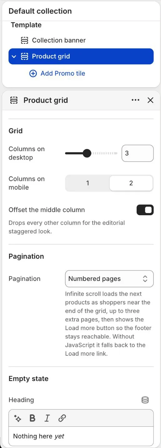
Empty state
| Setting | Choices | Default | Notes |
|---|---|---|---|
| Heading | Text (italic word allowed) | Nothing here yet | |
| Text | Rich text | There are no products in this collection right now. Check back soon, or start from one of the links below. | |
| Button label | Text | Shop all | |
| Button link | Link | Empty | |
| Second button label | Text | Browse all collections | |
| Second button link | Link | Empty | |
| Empty state color scheme | Any color scheme | Scheme 1 | When different from the section color scheme, the empty state is a band with an inset thin line frame. |
Style
| Setting | Choices | Default | Notes |
|---|---|---|---|
| Color scheme | Any color scheme | Scheme 1 | |
| Drawer color scheme | Any color scheme | Scheme 1 | Filter drawer, shown on mobile and in the drawer layout. |
Spacing: Top padding (80 px, 0 to 200 px), Bottom padding (80 px, 0 to 200 px). These add space above and below the section.
Block: Promo tile
A tile inside the product grid, such as a seasonal story or an offer. Add up to 4 Promo tile blocks.
Content
| Setting | Choices | Default | Notes |
|---|---|---|---|
| Image | Image | Empty | Optional. Without an image the tile is a solid color panel. Add alt text to the image in Files. |
| Heading | Text (italic word allowed) | The new edit | |
| Text | Rich text | A short line about the offer, the story or the season. | |
| Button label | Text | Shop now | |
| Button link | Link | Empty |
Placement
| Setting | Choices | Default | Notes |
|---|---|---|---|
| Show after product | 1 to 24 | 4 | The tile appears after this product on the first page only. It is hidden while filters are active. |
| Width on desktop | 1 column; 2 columns | 1 column | On phones the tile is always one column. If two columns do not fit in that row, the tile is one column. |
| Show on | All collections; One collection | All collections | |
| Collection | Collection | Empty | Only used when Show on is set to One collection. |
Style
| Setting | Choices | Default | Notes |
|---|---|---|---|
| Color scheme | Any color scheme | Scheme 4 |
Preset defaults: both presets ship with one promo tile. Placket has "The everyday edit" after product 5, one column, in Scheme 4. Bodice has "After dark" after product 6, two columns, in Scheme 3.
How to add a promo tile
- Go to Online Store > Themes > Customize and open a collection page.
- Select the Product grid section, then Add block > Promo tile.
- Add an Image (optional), a Heading, Text, a Button label and a Button link.
- Set Show after product. For example 4 puts the tile after the fourth product.
- Set Width on desktop to 1 column or 2 columns.
- To show the tile in one collection only, set Show on to One collection and pick the Collection.
- Choose a Color scheme and select Save.
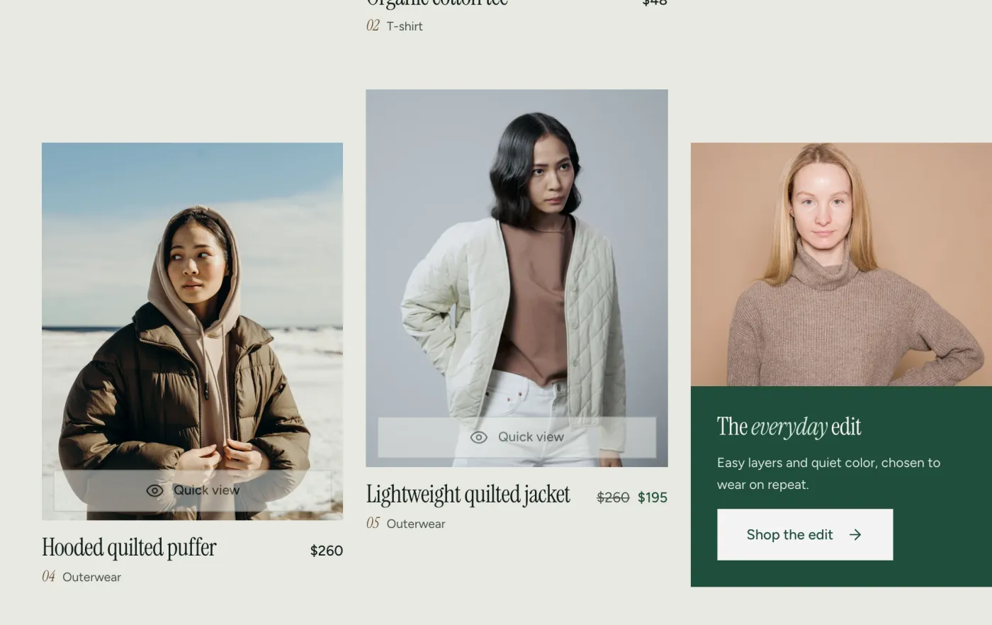
You can add up to 4 promo tiles. Give each one a different Show after product number.
Tips
- Infinite scroll needs no extra setup. It loads up to three more pages as the shopper nears the end of the grid. After that, a Load more button appears, so the footer stays easy to reach. The limit of three pages is fixed and cannot be changed. The product count and the products per page still apply.
- Promo tiles take the place of a grid slot. They show on the first page only, and they hide when a shopper uses filters, so filtered results stay clean. See How to add a promo tile.
- Filters come from the Shopify Search & Discovery app. The theme controls only how they look. See Filters and search.
- Show as buttons takes a comma-separated list of filter names (default "Size"). Those filters appear as square buttons instead of a checkbox list. The names must match your filter names exactly.
- The Sidebar filter layout shows on desktop only. Phones always use the drawer.
- Essential six shows these sort choices: Featured, Newest first, Best selling, Price low to high, Price high to low, Name A to Z. All Shopify options shows every sort option Shopify offers.
- The default order for a collection is set in your admin (Products > Collections > open a collection > Sort). Shoppers can change it with the sort menu.
- The product card look (image ratio, hover image, card subtitle, badges) comes from Theme settings.
Collection list page
Shows a grid or index of collections. It is the page at /collections.
Editor name: Collection list page. Where you can add it: Collection list page.
Settings
Content
| Setting | Choices | Default | Notes |
|---|---|---|---|
| Subheading | Text | Shop by category | |
| Italic accent in heading | None; Last word | Last word | Titles come from Shopify and cannot hold italic text, so the theme italicizes the last word. |
| Heading size | Small; Medium; Large | Large | Small 64px, medium 88px, large 104px at 100%. Scaled by Heading size in Theme settings. |
| Text | Rich text | Browse our collections and find something you love. | |
| Show breadcrumb | On or off | On | |
| Collections | List of collections | Empty | Choose and order the collections to show. Leave empty to show all collections in alphabetical order. |
Grid
| Setting | Choices | Default | Notes |
|---|---|---|---|
| Collections per page | 4 to 48 | 8 | |
| Columns on desktop | 1 to 6 | 4 | Shown when Layout is Grid. |
| Columns on mobile | 1; 2 | 2 | Shown when Layout is Grid. |
| Offset alternate columns | On or off | On | Shown when Layout is Grid. |
Collection card
| Setting | Choices | Default | Notes |
|---|---|---|---|
| Show product count | On or off | On | |
| Link label | Text | Shop now |
Style
| Setting | Choices | Default | Notes |
|---|---|---|---|
| Color scheme | Any color scheme | Scheme 1 | |
| Layout | Grid; Index, ruled rows with image strip | Grid | |
| Image ratio | Adapt to image; Portrait (4:5); Square (1:1); Landscape (3:2) | Portrait (4:5) | Shown when Layout is Grid. |
Spacing: Top padding (80 px, 0 to 200 px), Bottom padding (80 px, 0 to 200 px). These add space above and below the section.
Tips
- Pick and order collections with Collections. If you pick none, all collections show in alphabetical order.
- The Index, ruled rows with image strip layout lists collections as large type rows.
Search results
The page shoppers see after they search. It shows tabs for All, Products, Articles and Pages, each with a count, plus filters for products.
Editor name: Search results. Where you can add it: Search page.
Settings
Content
| Setting | Choices | Default | Notes |
|---|---|---|---|
| Subheading | Text | Search results | |
| Heading | Text | Results for | The search words are added after this text in italic. |
| Heading when nothing is found | Text | No results for | |
| Heading size | Small; Medium; Large; Extra large | Large | Small 64px, medium 88px, large 104px, extra large 118px at 100%. Scaled by Heading size in Theme settings. |
Results
| Setting | Choices | Default | Notes |
|---|---|---|---|
| Show result tabs | On or off | On | Tabs: All, Products, Articles, Pages, each with a count. |
| Include articles | On or off | On | |
| Include pages | On or off | On | |
| Items per group on All tab | 2 to 8 | 4 | |
| Results per page | 8 to 48 | 24 | Applies to single-type tabs. |
| Product columns on desktop | 1 to 6 | 4 | |
| Highlight search words | On or off | On | Matches are shown in semibold in the accent color. |
| Show group links | On or off | On | |
| Products link label | Text | View all products | |
| Articles link label | Text | Read the blog | |
| Blog for articles link | Blog | Empty |
No results
| Setting | Choices | Default | Notes |
|---|---|---|---|
| Text | Rich text | We could not find anything for “{terms}”. Check the spelling, try a shorter word, or start from a collection. | Use {terms} to insert the search words. |
| Suggested searches | Text | Empty | Comma-separated. Shown as buttons. |
| Browse menu | Menu | Empty | Menu of collections shown as large links. |
| Products to show | Collection | Empty | Shown when a search has no results. Leave empty to show your store's products. |
| Help text | Rich text | Still looking? Try another word, or start from one of our collections. |
Style
| Setting | Choices | Default | Notes |
|---|---|---|---|
| Color scheme | Any color scheme | Scheme 1 | |
| Layout | Stacked; Split, heading beside the form | Stacked |
Spacing: Top padding (80 px, 0 to 200 px), Bottom padding (80 px, 0 to 200 px). These add space above and below the section.
Tips
- When a search finds nothing, the section shows the Text with the search words, Suggested searches as buttons, a Browse menu of collections and a few products.
- Use {terms} in the no results Text to insert the words the shopper typed.
- Turn off Include articles or Include pages to search products only.
- Blog for articles link picks which blog the "Read the blog" link goes to.
- Filters on the search page also come from Search & Discovery.
Predictive search
Predictive search shows suggestions as the shopper types in the search field in the header. The section has no settings of its own. The settings are in Theme settings > Search. See Theme settings > Search.