Product and catalog · Placket 1.0.0
Product page
Last updated: November 2, 2026
This page explains the features of the product page and how to set each one up. For every setting of the Product information section, see Product page sections.
What the product page contains
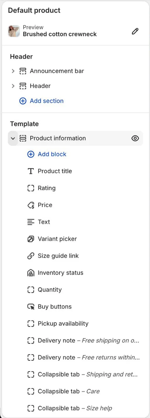
By default the product page has the gallery, product title, star rating, price, variant picker, size guide link, stock message, quantity, buy buttons, pickup availability, two delivery notes, a Product highlights block and three tabs (Shipping and returns, Care, Size help). Below that are the sections Complete the look, Product recommendations, Recently viewed and Size guide drawer. The Fit guide section is available in Add section but is not part of the default page. Every default text is neutral, so it reads right for clothing, sunglasses and bags.
To change the page, go to Online Store > Themes > Customize, open Products in the page picker and choose a product. Add, remove and reorder blocks in the left bar.
The theme has one product template. Everything you type in the editor is the same on every product that uses it. Text for a single product goes in the product description. See Product content.
Blocks
Blocks available in Product information:
| Block | What it does |
|---|---|
| Product title | The title, with an optional product type line above it and an italic last word |
| Rating | Stars and the number of reviews, from your review app |
| Price | Price, sale price, unit price and a note beside it |
| Text | Your own text, or the product description when left empty |
| Variant picker | Options as swatches, buttons or a dropdown |
| Size guide link | A link that opens the Size guide drawer, or a page you choose |
| Inventory status | A real stock message, such as "Low stock: 3 left" |
| Quantity | A quantity selector |
| Buy buttons | Add to cart, dynamic checkout buttons and the gift card recipient form |
| Pickup availability | Local pickup status |
| Delivery note | A short line with an icon, such as "Free returns within 30 days" |
| Product highlights | A heading and up to four label and value rows, such as Delivery and Returns |
| Fit notes | A heading and up to three label and value rows about fit |
| Collapsible tab | A tab with text you type. Can be shown as a row of tabs on desktop |
| Complete the look link | A button that scrolls to the Complete the look section |
| Share | Shares the product link |
| Custom Liquid | Your own code |
| Apps | App blocks |
In the theme editor, the blocks of the Product information section show in the left bar in this order. Drag a block by its handle to move it:
Variant pickers
The Variant picker block shows one group per product option. You can change how each group looks.
- Open a product page in the theme editor.
- Select the Variant picker block.
- Choose Other options (Buttons or Dropdown) for options such as Size.
- Set Sold out values to Struck through or Dimmed. Sold out values stay visible but are marked.
When a shopper picks a sold-out combination, the page says which value is sold out and which values are still available.
Color swatches
Color options appear as swatches when two things are true:
- The option name is listed in Options shown as swatches in the Variant picker block. The default is "Color,Colour".
- Each color value has a swatch color or image in Shopify.
If a value has no swatch, it appears as a text button instead.
To give color values swatches, use Shopify's standard Color attribute:
- In your admin, open the product.
- Under Product category, choose the closest category (for example Clothing > Dresses).
- In Variants, add an option. Pick Color from the list of suggested options so it is linked to the standard Color attribute. Select the color values from the list. Each value has a swatch color.
- Save the product.
Steps in the admin can change. If you do not see Color suggested, search the Shopify Help Center for "swatches".
To show color dots on product cards, turn on Show color swatches in Theme settings > Product cards.
Size guide
Shoppers see a link beside the size label, on products that have a size option (an option named Size, or a common translation such as Taille, Größe, Talla or Taglia). Products without sizes, such as sunglasses, show no link. It opens a drawer with your size tables and measuring steps. You build the tables in the editor. They are the same on every product.
- In the theme editor, open a product page and select the Size guide drawer section.
- Select a Size table block. Fill in Heading, Note and Table data. Add up to 4 Size table blocks, for example one for tops and one for bottoms.
- Add Measuring step blocks that say how to measure, and an optional Image.
- Check that a Size guide link block exists in Product information and that its Size option name matches your size option (default "Size"). To show the link on every product, set Show for to All products.
- Select Save.
Table data is plain text. The first line is the header. Write one row per line and split the columns with |. The first column is the size:
Size | Bust | Waist
S | 34 in / 86 cm | 27 in / 69 cm
M | 36 in / 91 cm | 29 in / 74 cm
To show two units in one cell, put a space, a slash and a space between them, as in 34 1/2 in / 86 cm. A slash without spaces stays as typed, so fractions like 1/2 work. The Units setting then shows inches, then centimeters, or only one of them. Empty rows are skipped, and a Size table block with no table data shows nothing. In the Note you can write {size} for the size the shopper picked. That size's row is highlighted.
If you already have a size chart on a page, open the Size guide link block and pick the page in Size guide page link. The link then opens that page. Leave it empty to open the drawer. See Size guide drawer.
Collapsible tabs
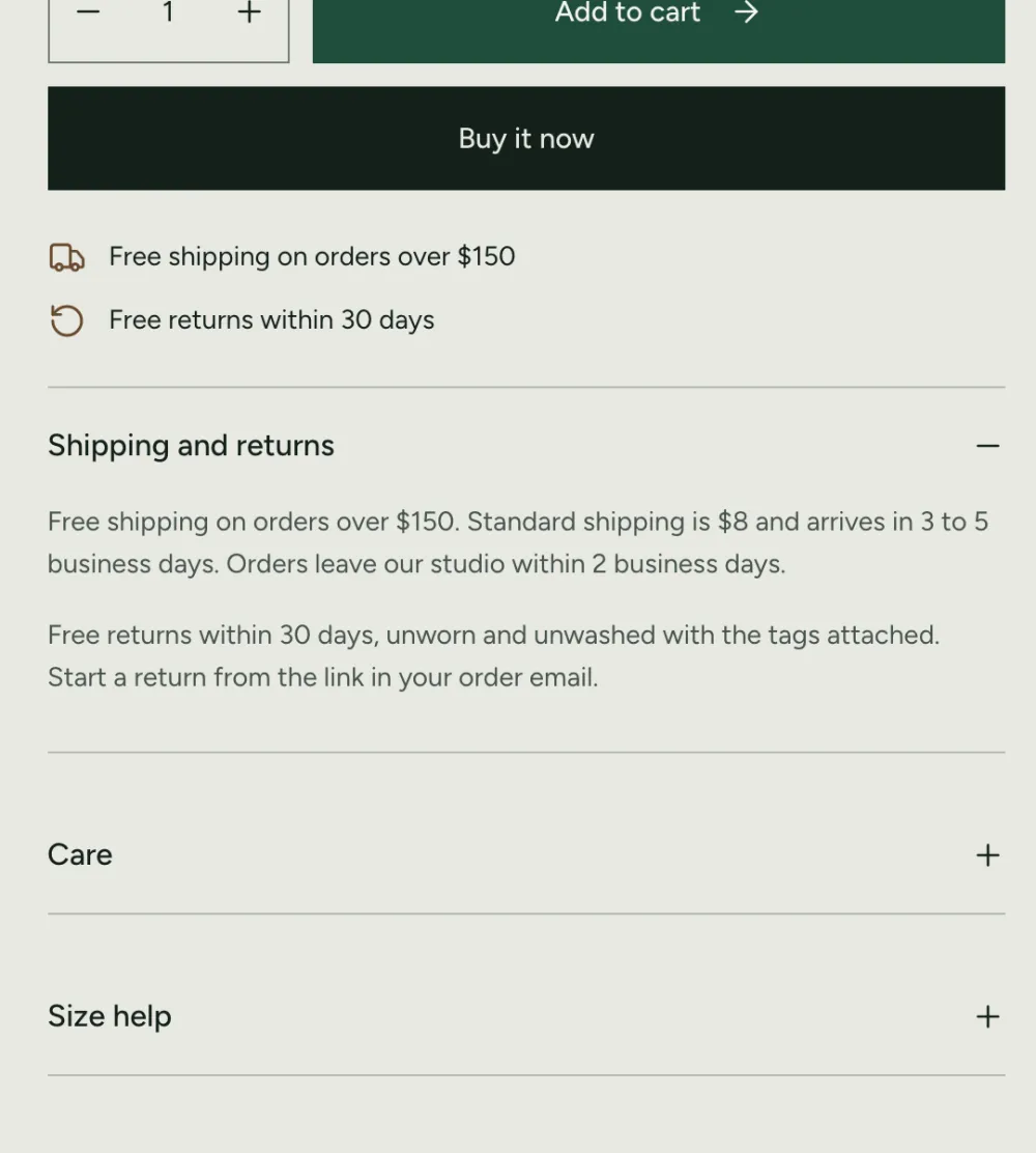
The default product page has three Collapsible tab blocks: Shipping and returns, Care and Size help. Each one holds text you type in the editor. The text is the same on every product, so keep it general enough to fit clothes and accessories.
- In the theme editor, open a product page and select a Collapsible tab block.
- Change the Heading and type your text in Content.
- Set Open by default if the tab should be open when the page loads. In the default template the Shipping and returns tab opens by default.
- Select Save.
Good to know:
- The tab is hidden when Content is empty. No empty tab shows.
- To add a tab, select Add block > Collapsible tab in Product information. To remove one, select it and choose Remove block.
- For text that differs per product, such as fabric or measurements of one item, write it in the product description. See How do I show different details per product?
Product highlights and fit notes
Two blocks show short facts as label and value rows. The rows are the same on every product.
- Product highlights. Set a Heading and up to four rows (Row 1 label and Row 1 value to Row 4 label and Row 4 value). The default rows are Delivery, Returns and Support.
- Fit notes. Set a Heading and up to three rows. Use it for general fit advice, for example how the brand sizes.
Rows with an empty label or value are skipped. The block is hidden when every row is empty. Width sets whether a block sits beside another half-width block or takes the full row. You can have one of each block per page.
Tabs or accordion
Collapsible tabs can look like an accordion (headings that open and close) or like a row of tabs.
- In the theme editor, open a product page and select the Product information section.
- Under Details tabs, set Tab style to Accordion or Tabs.
- Select Save.
What each choice does:
- Accordion: every tab is a heading that opens and closes. This is the default in the Placket preset.
- Tabs: on desktop, the tabs sit in a row and one shows at a time. Shoppers can use the arrow keys to move between tabs. This is the default in the Bodice preset.
- On phones (screens narrower than 750 px) the tabs always turn into an accordion.
- Only Collapsible tab blocks that sit next to each other form a tab row. If you place another block between two tabs, they stay separate.
- A single tab alone is shown as an accordion item.
- Tabs with no content are left out.
Stock message
The Inventory status block shows how many items are left, using your real inventory. It never shows made-up numbers.
- In the theme editor, open a product page and select the Product information section.
- Select Add block > Inventory status, or select the block that is already there.
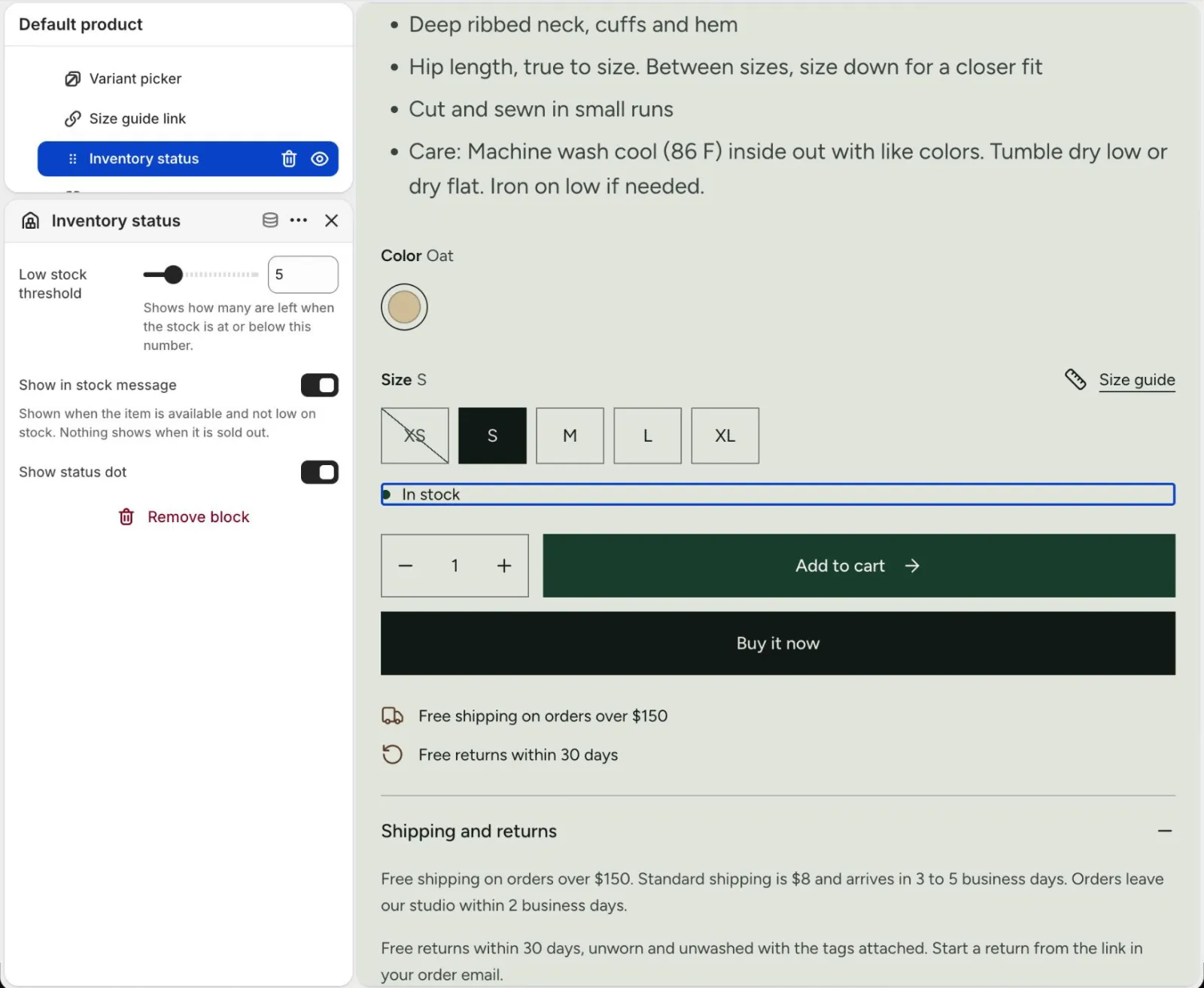
- Set Low stock threshold (1 to 20, default 5). The message "Low stock: 3 left" shows when the stock is at or below this number.
- Turn Show in stock message on to show "In stock" when the item is available and not low.
- Turn Show status dot on or off.
- Select Save.
Good to know:
- In your admin, the variant needs Track quantity turned on, with a stock count. Without it, the block can say "In stock", but it cannot show a count.
- When the item is sold out, the block shows nothing. The Add to cart button already says sold out.
- The message changes when the shopper picks another variant.
- To hide the stock message, remove the block.
Delivery notes
A Delivery note is a short line with an icon, such as "Delivery options are shown at checkout". Add as many as you need.
- In the Product information section, select Add block > Delivery note.
- Pick an Icon: Truck, Return arrow, Box or None.
- Type the Text.
- Optional: add a Link label and a Link, for example to your shipping policy page.
- Select Save.
Delivery notes do not show on gift card products. Both presets ship with two notes: one for delivery and one for returns. Edit the text to match your policy.
Reviews and stars
The theme does not collect reviews. A review app does. The theme shows stars when the app has saved a rating for the product.
The stars come from two standard product metafields: reviews.rating and reviews.rating_count. Review apps such as Judge.me fill them. The theme reads them and shows the stars:
- On the product page, in the Rating block.
- On product cards, when Show product rating is on in Theme settings > Product cards.
- In the quick view window.
Products with no reviews show no stars.
To set up reviews:
- Install a review app from the Shopify App Store and collect reviews.
- Check in the app's help page that it saves the standard rating metafields.
- In the theme editor, open a product page. The default page has a Rating block under the title. If you removed it, select Add block > Rating in Product information.
- Add the app's review widget. In Product information, select Add block and pick the app under Apps. Or select Add section > Apps below the product information and pick the app. Only apps that offer theme app blocks appear.
- Check the Reviews section ID of the Rating block. Selecting the stars scrolls to the element with this ID. Most review apps use
shopify-product-reviews. If your app uses another ID, type it here. - Select Save.
If the stars do not show, see Why don't I see stars?
Accessories and other product types
The theme ships one product template, so clothes and accessories share the same page. Keep tab text store-wide, for example Care text that covers garments and accessories, and put item details in the product description.
To hide a part of the page that does not fit your products:
- In the theme editor, open a product page.
- To remove a block, such as Fit notes or Size guide link, select it and choose Remove block.
- To remove a section, such as Size guide drawer, select it in the left bar and choose Remove section.
- To keep a block but hide it, clear its text. Blocks and tabs with no text do not show.
- Select Save.
This changes every product that uses the template. If you need a different page for some products, Shopify lets you create another product template (Create template in the page picker) and assign it in the product's Theme template setting. This is optional, and the theme does not ship one.
Pickup availability
The Pickup availability block tells shoppers where they can pick up the item and when it is ready.
- In your admin, go to Settings > Shipping and delivery > Local pickup and turn on local pickup for a location.
- Make sure the product has stock at that location.
The block shows the pickup status for the selected variant, the time it is ready, and a link that opens a list of all pickup locations with their stock, address and phone. If your store has no pickup locations, the block shows nothing.
Shop Pay Installments
When your store qualifies, the theme shows Shopify's Shop Pay Installments message under the buy buttons. The theme does not have a setting for it.
- In your admin, go to Settings > Payments.
- Activate Shop Pay and turn on Shop Pay Installments if it is offered in your country.
The message appears only for eligible products and prices.
Gift card products
On a gift card product, the Buy buttons block shows a recipient form. The form is on by default (Show gift card recipient form). See Gift cards.
Complete the look
The Complete the look section shows products that pair with the one being viewed.
- In the theme editor, open a product page and select the Complete the look section.
- Under Picked products, pick up to 6 products. They show on every product page that uses the template.
- Select Save.
To show a button that scrolls to the section, keep the Complete the look link block in Product information. The block shows only when the section is on the page and has products.
The product being viewed is never listed. If you pick it on its own page, the section skips it. If it was the only pick, the section uses Shopify's complementary recommendations instead.
If Picked products is empty, the section uses Shopify's complementary recommendations, which are different for each product. It hides itself when there are none, and the Complete the look link block hides with it. Remove the section if you do not want it.
Complementary products
Complementary recommendations need the free Shopify Search & Discovery app. Complete the look uses them when Picked products is empty. The Product recommendations section can use them too.
- Install the free Shopify Search & Discovery app.
- Open the app, go to Recommendations > Complementary products, and choose a product.
- Add complementary products.
- For Product recommendations, set Recommendation type to Complementary products.
Related products need no setup. See Filters and search.
Gallery, zoom and sticky bar
- Gallery style: Stacked plates show the first image large and the rest two across. One image at a time shows a carousel. Phones always show one image at a time.
- Show image zoom lets shoppers select an image to zoom. Edit the hint in Zoom hint.
- Keep product info in view on desktop pins the right column while the gallery scrolls.
- Show sticky add to cart on mobile shows a bar with an Add to cart button once the main button scrolls out of view.
- The gallery supports images, videos, external videos (YouTube, Vimeo) and 3D models. Product videos play muted. Turn on Loop product videos to repeat them.
- Each image's alt text is used as its caption when Show plate captions is on. Write alt text in your admin. See Performance and images.