Settings · Placket 1.0.0
Navigation and menus
Last updated: November 2, 2026
Menus are created in your Shopify admin, not in the theme editor. The theme then shows them in the header, the mobile menu and the footer.
Create or edit a menu
- In your admin, go to Online Store > Navigation.
- Open
main-menu(or select Add menu). - Select Add menu item. Enter a name and pick a link.
- Drag an item slightly to the right to make it a sub-item of the item above. Menus can have three levels.
- Select Save menu.
The theme uses these menus by default:
| Menu | Where it is used |
|---|---|
main-menu | Header menu, mobile menu, and the empty cart navigation |
footer | The footer menu block, and help links in the empty cart |
customer-account-main-menu | Links in the account sheet |
You can use other menus too. In the theme editor, pick the menu in the Main menu, Mobile menu, Customer account menu or Footer menu settings.
Mega menu
A mega menu is a wide panel that opens under a main menu item and shows its sub-menus as columns.
How levels work:
- First level: the item in the header bar.
- Second level: column headings in the panel.
- Third level: the links under each heading.
Set it up:
- In Online Store > Navigation, build a menu with three levels. For example: Clothing > Tops > Knitwear.
- In the theme editor, open the Header section.
- Make sure Enable mega menu is on (it is on by default in Placket).
- Choose Open panel on: Hover, click or keyboard, or Click or keyboard only.
- (Optional) Select Add block > Mega menu panel. In Menu item title, type the name of the first-level item exactly as in your menu (for example Clothing). Add a Description, Link text and a Featured product with a Featured label.
- Select Save.
The Mega menu panel block is optional. Without it the panel still opens and shows the columns. The block adds an intro, a link and a featured product. You can add up to six blocks.
If you turn off Enable mega menu, items with sub-menus open as a small dropdown.
Menu promos
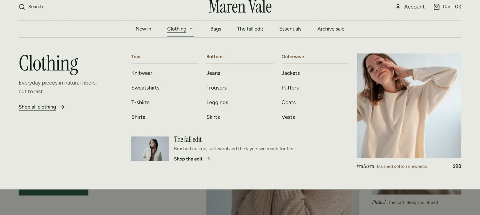
A menu promo is a small card with an image, a heading, a short text and a link. It shows inside the dropdown of one main menu item. Use it for a seasonal edit or a new arrival.
- In Online Store > Navigation, check that the menu item has sub-items. A promo shows only inside a dropdown. An item with no sub-items has no dropdown, so a promo for it never shows.
- In the theme editor, open the Header section.
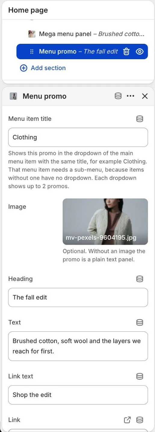
- Select Add block > Menu promo.
- In Menu item title, type the name of the first-level item exactly as in your menu (for example Clothing). Capital letters do not matter.
- Add an Image (optional), a Heading, Text, Link text and a Link.
- Select Save.
This is how the promo shows in the Clothing mega menu on the store:
Good to know:
- Each dropdown shows up to 2 promos. You can add up to 12 Menu promo blocks in total.
- With the mega menu on, the promos sit in the wide panel. With the mega menu off, they sit in the small dropdown.
- The Placket preset ships with a promo for Clothing. The Bodice preset ships with a promo for Dresses. If your store menu has no item with that name, or the item has no sub-items, the promo does not show. Rename the Menu item title or add a dropdown to the menu item.
- On phones, promos show inside the sub-menus of the menu drawer. To hide them there, turn off Show menu promos in sub-menus in the Header section.
When the menu does not fit
On a laptop or a small desktop window, a long menu may not fit beside the logo. The theme checks this by itself. When the menu does not fit, the header shows the hamburger button and the menu drawer, the same as on a phone. When the window is wider, or you shorten the menu, the full menu comes back.
To keep the full menu on a laptop:
- Use fewer top-level items, or shorter names. Five to seven items work well.
- Choose a layout with more room, such as Logo left, main menu beside it or Main menu split around centered logo in the Header section.
- Lower Main menu text size or Space between main menu items in the Header section.
- Use a smaller logo.
Mobile menu
On phones, the menu opens in a drawer that uses the Mobile menu setting. In the Header section you can also:
- Set the Link size.
- Show or hide the account link, search link and country selector.
- Show or hide menu promos with Show menu promos in sub-menus.
- Show a featured product tile with Show featured product in sub-menus. The tile uses the featured product of the matching Mega menu panel, or the Featured product tile you pick.
Footer menus
Each Footer menu block in the Footer section shows one menu with its own heading. You can add up to four menu blocks.
Tips
- Keep top-level items to five to seven.
- Use short names. Long names wrap to a second line.
- The header menu highlights the page the visitor is on.