Sections · Placket 1.0.0
Product page sections
Last updated: November 2, 2026
The product page is built from several sections. Product information is the main one and is made of blocks. The others add extra content below it. For a task-based guide, see Product page.
The default product page contains these sections, in this order: Product information, Complete the look, Product recommendations, Recently viewed and Size guide drawer. The Fit guide section is not in the default order. You can add it from Add section when your products need it. The theme has one product template, so what you type in these sections is the same on every product. Text for one product goes in the product description. See Product content.
Product information
The main product section. It has the gallery, title, price, options, buy buttons and tabs. Almost everything in it is a block, so you can add, remove and reorder pieces.
The default blocks, from top to bottom, are: Product title, Rating, Price, Text, Variant picker, Size guide link, Inventory status, Quantity, Buy buttons, Pickup availability, two Delivery note blocks, Product highlights and three Collapsible tab blocks (Shipping and returns, Care, and Size help). The Fit notes block is available in Add block but is not in the default order.
Editor name: Product information. Where you can add it: Product pages. Blocks: up to 25.
Settings
Content
| Setting | Choices | Default | Notes |
|---|---|---|---|
| Show breadcrumbs | On or off | On | Home / collection / product. The collection is the one the shopper came from. |
| Show plate captions | On or off | On | Uses each image's alt text as the caption. The caption look (plate, figure, none) is set in Theme settings > Image captions. Shown when Thumbnails is not Cinema, film strip and info panel. |
Gallery
| Setting | Choices | Default | Notes |
|---|---|---|---|
| Gallery style | Stacked plates; One image at a time | Stacked plates | Stacked plates show the first image large, then the rest two across. Mobile always shows one image at a time. Shown when Thumbnails is not Cinema, film strip and info panel. |
| Show image zoom | On or off | On | |
| Zoom hint | Text | Select the image to zoom | Shown after the first caption. Leave empty to hide. Only used when zoom is on. |
| Loop product videos | On or off | Off | Product videos play muted and repeat. Off means they play once. |
Behavior
| Setting | Choices | Default | Notes |
|---|---|---|---|
| Keep product info in view on desktop | On or off | On | The right column stays pinned while the gallery scrolls. |
| Show sticky add to cart on mobile | On or off | On | A bar with the product, selected options and an Add to cart button appears once the main button scrolls out of view. |
| Show image in sticky bar | On or off | On |
Details tabs
| Setting | Choices | Default | Notes |
|---|---|---|---|
| Tab style | Accordion; Tabs | Accordion (Placket), Tabs (Bodice) | Tabs show one detail tab at a time on desktop. Phones always use an accordion. Applies to Collapsible tab blocks that sit next to each other. |
Style
| Setting | Choices | Default | Notes |
|---|---|---|---|
| Color scheme | Any color scheme | Scheme 1 | |
| Thumbnails | Left of the image; Below the image; Cinema, film strip and info panel | Left of the image | On mobile thumbnails always sit below the image. |
| Label band color scheme | Any color scheme | Scheme 3 | Cinema layout only. Band behind the fabric and fit label. Shown when Thumbnails is Cinema, film strip and info panel. |
| Image ratio | Adapt to image; Portrait (4:5); Square (1:1); Landscape (3:2) | Portrait (4:5) |
Spacing: Top padding (80 px, 0 to 200 px), Bottom padding (80 px, 0 to 200 px). These add space above and below the section.
Blocks
Block: Product title (one per section)
| Setting | Choices | Default | Notes |
|---|---|---|---|
| Show product type above heading | On or off | On | The small ruled line above the title. |
| Italic accent in heading | None; Last word | Last word | The product title comes from Shopify, so the theme italicizes the last word. |
| Heading size | Small; Medium; Large | Large | Small 64px, medium 88px, large 104px at 100%. Scaled by Heading size in Theme settings. |
Block: Rating (one per section)
| Setting | Choices | Default | Notes |
|---|---|---|---|
| Reviews section ID | Text | shopify-product-reviews | Selecting the stars scrolls to the element with this ID. Most review apps use shopify-product-reviews. The stars show only when a review app has saved a rating for the product. |
| Show review count | On or off | On |
Block: Price (one per section)
| Setting | Choices | Default | Notes |
|---|---|---|---|
| Note next to price | Text | Shipping calculated at checkout. | Leave empty to hide. |
| Price size | Medium; Large | Large |
Block: Text
| Setting | Choices | Default | Notes |
|---|---|---|---|
| Text | Rich text | Empty | Leave empty to show the product description. |
| Text size | Small; Medium; Large | Medium |
Block: Variant picker (one per section)
Options
| Setting | Choices | Default | Notes |
|---|---|---|---|
| Options shown as swatches | Text | Color,Colour | Option names, separated by commas. These options show color swatches instead of buttons. |
| Swatch shape | Circle; Square | Circle | |
| Swatch size | 20 to 40 px | 28 px | |
| Other options | Buttons; Dropdown | Buttons | |
| Show selected value in the label | On or off | On | Shows "Color Teal" and "Size M". |
| Sold out values | Struck through; Dimmed | Struck through |
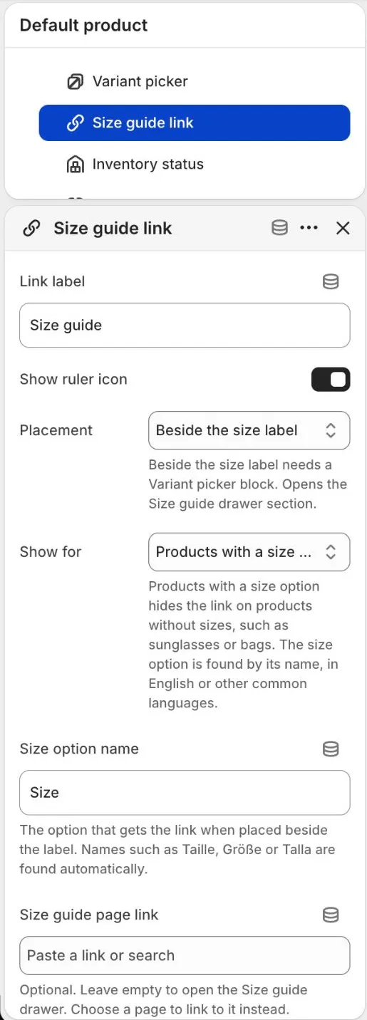
Block: Size guide link (one per section)
| Setting | Choices | Default | Notes |
|---|---|---|---|
| Link label | Text | Size guide | |
| Show ruler icon | On or off | On | |
| Placement | Beside the size label; On its own row | Beside the size label | Beside the size label needs a Variant picker block. Opens the Size guide drawer section. |
| Show for | Products with a size option; All products | Products with a size option | “Products with a size option” hides the link on products without sizes, such as sunglasses or bags. The size option is found by its name, in English or other common languages. |
| Size option name | Text | Size | The option that gets the link when placed beside the label. Names such as Taille, Größe or Talla are found automatically. |
| Size guide page link | Page or link | Empty | Optional. Leave empty to open the Size guide drawer. Choose a page to link to it instead. |
Block: Inventory status (one per section)
| Setting | Choices | Default | Notes |
|---|---|---|---|
| Low stock threshold | 1 to 20 | 5 | Shows how many are left when the stock is at or below this number. |
| Show in stock message | On or off | On | Shown when the item is available and not low on stock. Nothing shows when it is sold out. |
| Show status dot | On or off | On |
Block: Quantity (one per section)
| Setting | Choices | Default | Notes |
|---|---|---|---|
| Placement | Beside Add to cart; On its own row | Beside Add to cart | |
| Show quantity label | On or off | Off |
Block: Buy buttons (one per section)
| Setting | Choices | Default | Notes |
|---|---|---|---|
| Show dynamic checkout buttons | On or off | On | Buy it now and wallet buttons such as Shop Pay. Wallet buttons keep their own look. |
| Add to cart style | Primary; Secondary | Primary | |
| Show arrow in button | On or off | On | |
| Show gift card recipient form | On or off | On | Only appears on gift card products. |
Block: Pickup availability (one per section)
This block has no settings.
Block: Delivery note
| Setting | Choices | Default | Notes |
|---|---|---|---|
| Icon | Truck; Return arrow; Box; None | Truck | |
| Text | Text | Delivery options are shown at checkout. | |
| Link label | Text | Empty | Optional. Shown after the text when you also add a link. |
| Link | Link | Empty |
You can add as many Delivery note blocks as you like. They do not show on gift card products.
Block: Product highlights (one per section)
| Setting | Choices | Default | Notes |
|---|---|---|---|
| Heading | Text | Highlights | Optional. Rows with an empty label or value are skipped, and the block is hidden when every row is empty. The same rows show on every product. |
| Width | Half (sits beside another half block); Full | Half (sits beside another half block); the default template uses Full | In the Cinema layout the block moves to the label strip. |
| Row 1 label, Row 1 value | Text | Delivery, Options shown at checkout | |
| Row 2 label, Row 2 value | Text | Returns, See our returns policy | |
| Row 3 label, Row 3 value | Text | Support, Questions? Contact us | |
| Row 4 label, Row 4 value | Text | Empty |
Block: Fit notes (one per section)
| Setting | Choices | Default | Notes |
|---|---|---|---|
| Heading | Text | Fit | Optional. Rows with an empty label or value are skipped. The same rows show on every product. |
| Width | Half (sits beside another half block); Full | Half (sits beside another half block) | In the Cinema layout the block moves to the label strip. |
| Row 1 label, Row 1 value | Text | Fit, See the size guide for measurements | |
| Row 2 label, Row 2 value | Text | Sizing, Between sizes? Contact us for advice | |
| Row 3 label, Row 3 value | Text | Empty |
Block: Collapsible tab
| Setting | Choices | Default | Notes |
|---|---|---|---|
| Heading | Text | Details | The default template has the tabs Shipping and returns, Care and Size help. |
| Content | Rich text | Add information that applies to every product. | Store-wide text shown on every product. The tab is hidden when this is empty. |
| Open by default | On or off | Off | In the default template the Shipping and returns tab is open. |
| Icon | Plus and minus; Chevron | Plus and minus |
Block: Complete the look link (one per section)
| Setting | Choices | Default | Notes |
|---|---|---|---|
| Label | Text | Complete the look | Scrolls to the Complete the look section. Hidden when that section is not on the page or has no products. |
| Style | Primary; Secondary; Link | Link |
Block: Share (one per section)
| Setting | Choices | Default | Notes |
|---|---|---|---|
| Label | Text | Share | |
| Show icon | On or off | On | Uses the device share sheet when available, otherwise copies the product link. |
Block: Custom Liquid
| Setting | Choices | Default | Notes |
|---|---|---|---|
| Custom Liquid | Liquid code | Add app snippets or custom Liquid code. |
App block. Add blocks from apps you have installed (see Apps and app blocks).
Tips
- Thumbnails (the Layout setting) has three choices: Left of the image, Below the image, and Cinema (film strip and info panel). On phones thumbnails always sit below the image.
- The Variant picker shows an option as color swatches only when its name is listed in Options shown as swatches (default "Color,Colour") and the value has a swatch color or image in Shopify. See Product page.
- The Size guide link block opens the Size guide drawer, or a page if you pick one in Size guide page link. Set its Size option name to match your option, for example "Size". The link shows only on products that have a size option. Choose All products in Show for to show it everywhere.
- Collapsible tab blocks hold text you type in the editor. It is the same on every product, so write store-wide text. For text that differs per product, use the product description. See Collapsible tabs.
- Tab style set to Tabs turns Collapsible tab blocks that sit next to each other into a row of tabs on desktop. See Product page > Tabs or accordion.
- The Rating block shows stars only when a review app has saved a rating for the product. See Product page > Reviews and stars.
- The Inventory status block uses real inventory only. See Product page > Stock message.
- The Product highlights and Fit notes blocks show the rows you type. Empty rows are skipped.
- Pickup availability only shows when the product is available for local pickup at a location in your store. See Product page.
- Buy buttons includes the gift card recipient form on gift card products. See Gift cards.
- Use the Apps block (an app block) or Custom Liquid block for the review widget, subscription widgets and similar.
Complete the look
Shows products that pair with the one being viewed. You pick the products in the editor, and they show on every product page that uses the template. If you pick none, it uses Shopify's complementary recommendations.
Editor name: Complete the look. Where you can add it: Product pages.
Settings
Content
| Setting | Choices | Default | Notes |
|---|---|---|---|
| Subheading | Text | Pairs well with | |
| Heading | Text (italic word allowed) | Complete the look | |
| Heading size | Small; Medium; Large | Large | Small 64px, medium 88px, large 104px at 100%. Scaled by Heading size in Theme settings. |
| Text | Rich text | Pieces that sit well with this one. | Shown under the heading. Leave empty to hide. |
Button
| Setting | Choices | Default | Notes |
|---|---|---|---|
| Button label | Text | Shop the look | Leave empty to hide the button. |
| Button link | Link | Empty | A collection or page that holds the full look. |
| Button style | Primary; Secondary; Link | Secondary |
Products
| Setting | Choices | Default | Notes |
|---|---|---|---|
| Picked products | List of products | Empty | Pick up to 6 products. They show on every product page that uses this template. Leave empty to use Shopify's complementary recommendations (needs the Shopify Search and Discovery app). The section hides when there are none. The product being viewed is never shown. |
| Products to show | 2 to 6 | 3 | Shown when Layout is not Stage, one product spotlight. |
Style
| Setting | Choices | Default | Notes |
|---|---|---|---|
| Color scheme | Any color scheme | Scheme 1 | |
| Layout | Text left, products staggered; Text left, products aligned; Text above, products below; Stage, one product spotlight | Text left, products staggered | |
| Image ratio | Adapt to image; Portrait (4:5); Square (1:1); Landscape (3:2) | Portrait (4:5) |
Spacing: Top padding (80 px, 0 to 200 px), Bottom padding (80 px, 0 to 200 px). These add space above and below the section.
Tips
- The section hides itself when there are no picked products and no complementary recommendations. The product being viewed is never listed: if it is in Picked products it is skipped, and if it is the only pick the section uses the recommendations.
- Complementary recommendations need the free Shopify Search & Discovery app, with complementary products set up for each product. See Filters and search.
- Add a Complete the look link block to the Product information section to give shoppers a button that scrolls to this section.
Fit guide
Explains the general fits you offer, such as Close, Regular and Relaxed, side by side. You type each fit in a block. It is the same on every product.
Editor name: Fit guide. Where you can add it: Product pages. Blocks: up to 3.
Settings
Content
| Setting | Choices | Default | Notes |
|---|---|---|---|
| Heading | Text (italic word allowed) | How it fits | |
| Heading size | Small; Medium; Large | Large | Small 64px, medium 88px, large 104px at 100%. Scaled by Heading size in Theme settings. |
| Text | Rich text | Every style is cut in one of these fits. Compare them to find the one that suits how you like to wear it. |
Row labels
| Setting | Choices | Default | Notes |
|---|---|---|---|
| Row 1 label | Text | Room | The four rows compare the fits. Set the label here and type the text for each fit in its block. Leave a label empty to hide that row. |
| Row 2 label | Text | Feel | |
| Row 3 label | Text | Best for | |
| Row 4 label | Text | Size tip |
Table
| Setting | Choices | Default | Notes |
|---|---|---|---|
| Show flat drawings | On or off | On | A simple flat garment drawing above each fit. The drawing shape is chosen in each Fit block. |
| Footnote | Text | Fit descriptions are a general guide. See the size guide for measurements. | Short note under the table. Leave empty to hide it. |
| Size guide link label | Text | Open the full size guide | Opens the Size guide drawer. Leave empty to hide the link. |
Style
| Setting | Choices | Default | Notes |
|---|---|---|---|
| Color scheme | Any color scheme | Scheme 1 | |
| Diagram tile color scheme | Any color scheme | Scheme 2 | Background of the garment diagram tiles. |
| Diagram ratio | Adapt to image; Portrait (4:5); Square (1:1); Landscape (3:2) | Landscape (3:2) |
Spacing: Top padding (80 px, 0 to 200 px), Bottom padding (80 px, 0 to 200 px). These add space above and below the section.
Blocks
Block: Fit (up to 3)
| Setting | Choices | Default | Notes |
|---|---|---|---|
| Fit name | Text | Close, Regular, Relaxed | The name of the fit. |
| Small label above the name | Text | Closer to the body, True to size, Extra room | Optional, for example True to size. |
| Description | Text | A sentence about the fit | |
| Drawing shape | Close; Regular; Relaxed | Close, Regular, Relaxed | How wide the flat drawing is cut. |
| Highlight this fit | On or off | Off (On for Regular) | Colors the drawing and the column to point out the most common fit. |
| Row 1 text | Text | Close, Comfortable, Generous | Shown beside the row labels set on the section. |
| Row 2 text | Text | ||
| Row 3 text | Text | ||
| Row 4 text | Text |
Tips
- The fits are general. They are the same on every product. For the fit of one item, write it in the product description.
- Row labels are set once on the section. Each Fit block holds the text for those rows.
- The Fit guide is not on the default product page, because it only suits clothing. Add it with Add section if you want it. Its size guide link also hides on products without a size option.
- Remove the section if your products do not need a fit guide.
Size guide drawer
A drawer that slides in from the side when a shopper selects the size guide link. It shows the size tables and measuring steps you type in the editor. They are the same on every product. On phones the table shrinks to fit the drawer and each cell shows the two units on two lines. A very wide custom table still scrolls sideways.
Editor name: Size guide drawer. Where you can add it: Product pages. Blocks: up to 9 (4 Size table blocks and 5 Measuring step blocks).
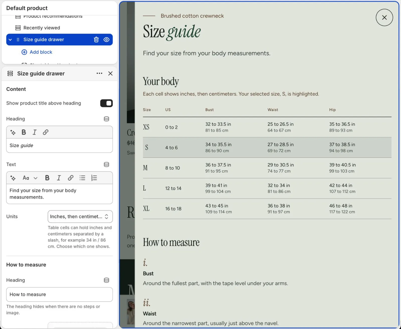
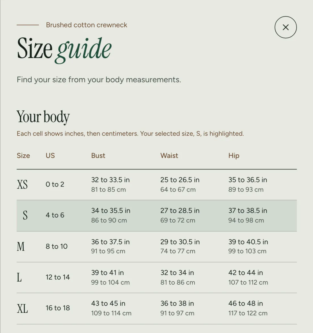
This is the drawer on the store. The row for the size the shopper picked is highlighted:
Settings
Content
| Setting | Choices | Default | Notes |
|---|---|---|---|
| Show product title above heading | On or off | On | |
| Heading | Text (italic word allowed) | Size guide | |
| Text | Rich text | Find your size from your body measurements. | |
| Units | Inches, then centimeters; Inches only; Centimeters only | Inches, then centimeters | Table cells can hold inches and centimeters separated by a slash, for example 34 in / 86 cm. Choose which one shows. |
How to measure
| Setting | Choices | Default | Notes |
|---|---|---|---|
| Heading | Text | How to measure | The heading hides when there are no steps or image. |
| Image | Image | Empty | Optional drawing or photo that shows where to measure. |
Footer
| Setting | Choices | Default | Notes |
|---|---|---|---|
| Footnote | Rich text | Between sizes? Size down for a closer fit. | |
| Full guide link label | Text | Open the full size guide | Leave empty to hide the link. |
| Full guide link | Link | Empty | Usually the Size guide page. |
Style
| Setting | Choices | Default | Notes |
|---|---|---|---|
| Color scheme | Any color scheme | Scheme 1 | |
| How to measure layout | Columns; Ruled rows | Columns | |
| Drawer width on desktop | 480 to 720 px | 620 px | Mobile drawers are always full width minus a 40px edge. |
Blocks
Block: Size table (up to 4)
| Setting | Choices | Default | Notes |
|---|---|---|---|
| Heading | Text | Your body | |
| Note | Text | Your selected size, {size}, is highlighted. | Optional. Use {size} for the size picked in the product form. |
| Table data | Text, several lines | A sample table with sizes S, M and L | First line is the header. One row per line, columns split by |. The first column is the size. For two units in one cell, put a space, a slash and a space between them, for example 34 1/2 in / 86 cm. A slash without spaces stays as typed, so fractions like 1/2 work. Empty rows are skipped. |
Block: Measuring step (up to 5)
| Setting | Choices | Default | Notes |
|---|---|---|---|
| Heading | Text | Bust | |
| Text | Text, several lines | Around the fullest part, with the tape level under your arms. |
How to write the table data
Table data is plain text. Write the header on the first line, then one row per line. Split the columns with |. The first column is the size, and the shopper's selected size is highlighted by matching it. Example:
Size | Bust | Waist
S | 34 in / 86 cm | 27 in / 69 cm
M | 36 in / 91 cm | 29 in / 74 cm
For a measurement in two units, write inches, a space, a slash, a space, then centimeters, as in 34 1/2 in / 86 cm. The Units setting picks what shows: both, inches only (the part before the slash) or centimeters only (the part after the slash). A slash without spaces on both sides is shown as typed, so fractions like 1/2 and cells like XS/S work. A cell without a spaced slash is shown as typed. Blank lines and rows with no size in the first column are ignored, extra cells beyond the header are left out and missing cells stay empty. A Size table block with no table data shows nothing.
Tips
- Add up to four Size table blocks, for example one for tops and one for bottoms. Give each a Heading.
- In the Note, use {size} for the size the shopper picked in the product form.
- Add up to five Measuring step blocks for the "How to measure" steps, and an Image that shows where to measure.
- Link to your full Size guide page with Full guide link.
- To send the size guide link to a page instead of the drawer, pick a page in the Size guide page link setting of the Size guide link block.
Product recommendations
Related or complementary products, shown on the product page and on the cart page.
Editor name: Product recommendations. Where you can add it: Product pages, Cart page.
Settings
Content
| Setting | Choices | Default | Notes |
|---|---|---|---|
| Subheading | Text | Empty | Optional small line above the heading. |
| Heading | Text (italic word allowed) | You may also like | |
| Heading size | Small; Medium; Large | Large | Small 64px, medium 88px, large 104px at 100%. Scaled by Heading size in Theme settings. |
| Link label | Text | View all | Leave empty to hide the link. |
| Link | Link | Empty | Leave empty to link to the product's first collection. |
Products
| Setting | Choices | Default | Notes |
|---|---|---|---|
| Recommendation type | Related products; Complementary products | Related products | Complementary needs the Shopify Search and Discovery app. Related works on every shop. |
| Products to show | 2 to 10 | 4 | |
| Columns on desktop | 2 to 5 | 4 | |
| Columns on mobile | 1; 2 | 2 |
Style
| Setting | Choices | Default | Notes |
|---|---|---|---|
| Color scheme | Any color scheme | Scheme 1 | |
| Layout | Staggered rows; Aligned rows | Staggered rows | Staggered pushes every second card down for an editorial rhythm. |
| Image ratio | Adapt to image; Portrait (4:5); Square (1:1); Landscape (3:2) | Portrait (4:5) |
Spacing: Top padding (80 px, 0 to 200 px), Bottom padding (80 px, 0 to 200 px). These add space above and below the section.
Tips
- Related products work on every store. Complementary products need Shopify Search & Discovery.
- Leave Link empty to link to the product's first collection.
Recently viewed
Shows products the shopper looked at earlier. It uses the browser's own storage, so it is private to each visitor and needs no setup.
Editor name: Recently viewed. Where you can add it: Product pages, Collection pages, Home page, Cart page.
Settings
Content
| Setting | Choices | Default | Notes |
|---|---|---|---|
| Subheading | Text | Empty | Optional small line above the heading. |
| Heading | Text (italic word allowed) | Recently viewed | |
| Heading size | Small; Medium; Large | Medium | Small 64px, medium 88px, large 104px at 100%. Scaled by Heading size in Theme settings. |
Products
| Setting | Choices | Default | Notes |
|---|---|---|---|
| Products to show | 2 to 8 | 4 | The current product is never included. The section stays hidden until the shopper has viewed enough products to fill at least one row. |
| Columns on desktop | 2 to 6 | 4 | |
| Columns on mobile | 1; 2 | 2 |
Style
| Setting | Choices | Default | Notes |
|---|---|---|---|
| Color scheme | Any color scheme | Scheme 1 | |
| Layout | Grid; Strip, thumbnail beside text | Grid | |
| Image ratio | Adapt to image; Portrait (4:5); Square (1:1); Landscape (3:2) | Square (1:1) | Shown when Layout is Grid. |
Spacing: Top padding (80 px, 0 to 200 px), Bottom padding (80 px, 0 to 200 px). These add space above and below the section.
Tips
- The current product is never included.
- The section stays hidden until the shopper has viewed enough products to fill a row, so it is empty for new visitors.